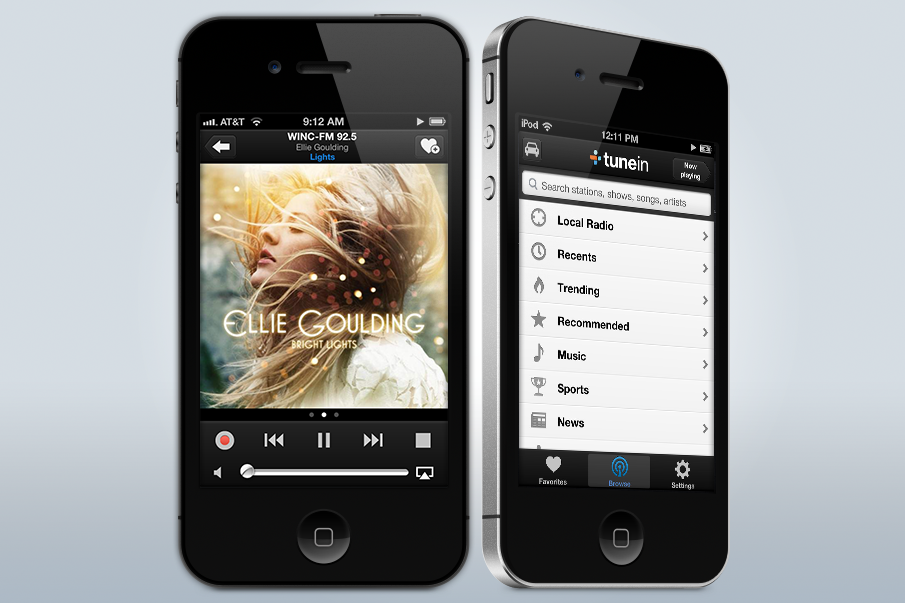
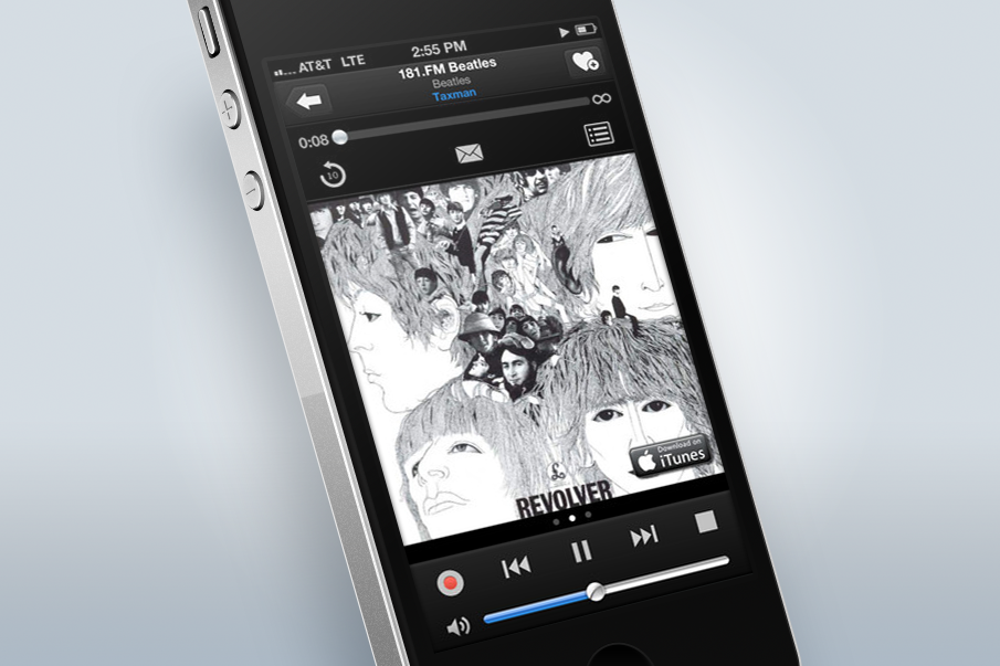
My goal was to create a flat and simple look and feel that would be useful and unobtrusive to the user. I wanted to focus to remain on the content. We brought the station and album artwork forward and simplified the album and station data so that you could always see what was playing in one look.
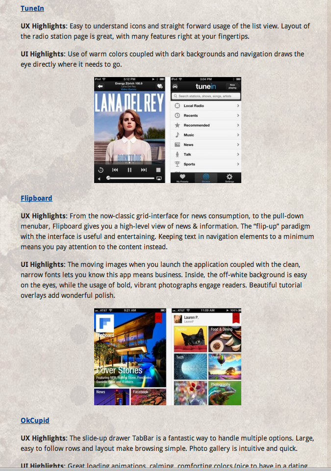
 Several app blogs and review sites covered the redesign at the time, and although I didn't manage to hold on to all of them I did catch one as it stacked the redesign in a list right next to flipboard.