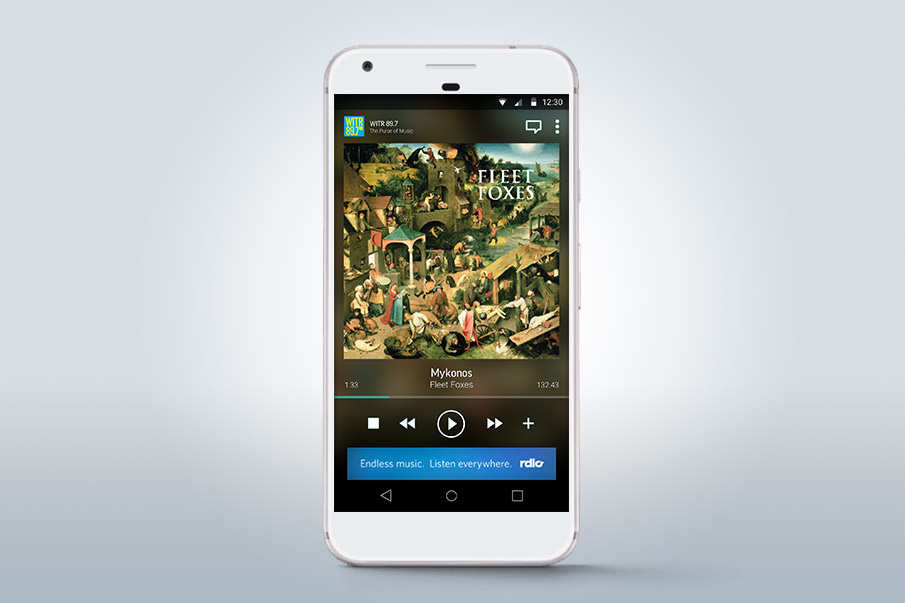
 The goal was to make our "player" screen more visual, immersive and beautiful - all the while improving the clarity of control and emphasizing the critical components.
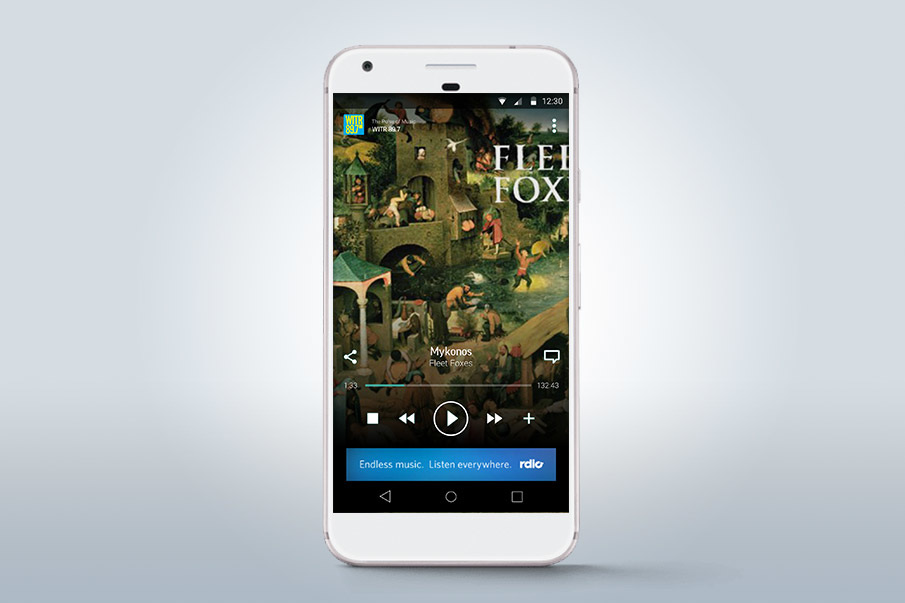 In this case I focused on album artwork and the "play / pause" controls - making both big and bold.
When a user wants to stop their content, it's absolutely critical that they be able to do so in a moments notice. Searching for the pause button, or even worse, missing it when you attempt to pause is a terrible experience.