Below is an overview of some of the pieces that I created, planned and product managed for the release. These were all accompanied by detail spec that lived in our shared wiki space "Confluence."
Mobile Flow Mapping
I created several critical mobile mapping flows to help our engineering team understand how we expected parts of the app to behave. These "mapping" docs became the de-facto requirements for our launch.
New User Mobile Paths Wireframes
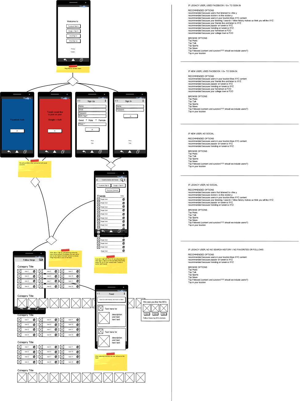 Android New User Mobile Paths Glossy Layout
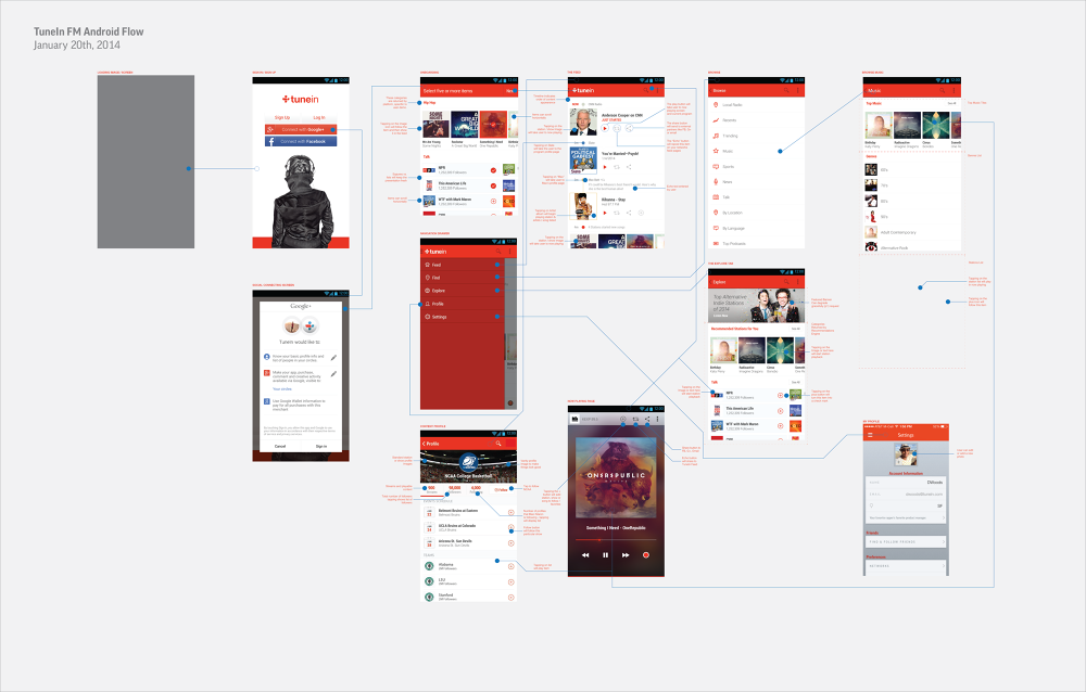 iOS New User Mobile Paths Glossy Layout
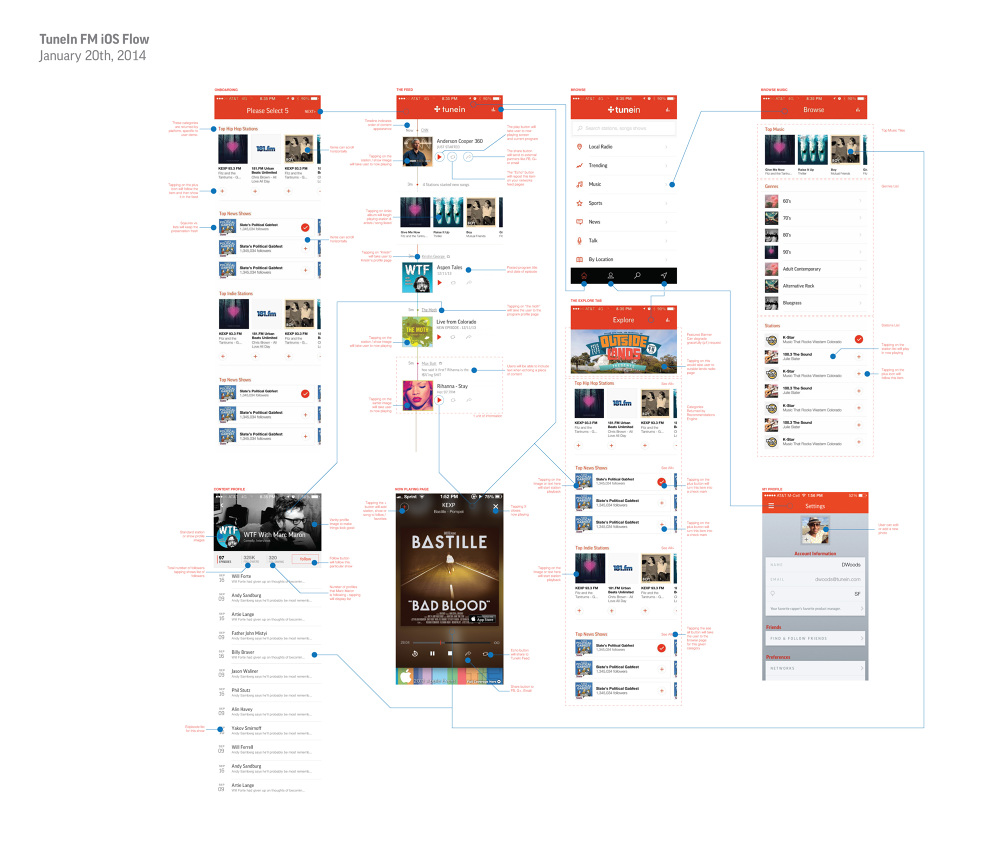 OnBoarding
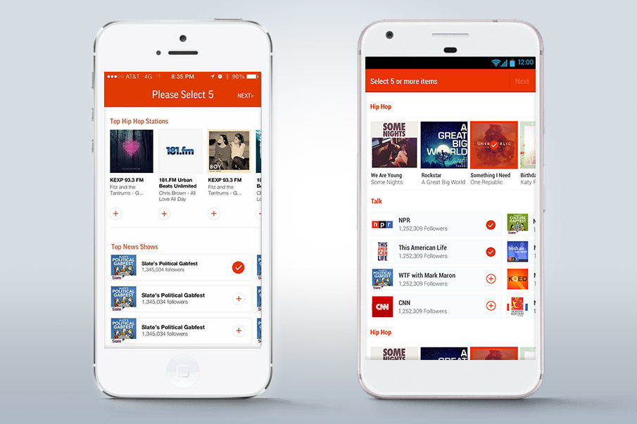
For the first time we introduced an onboarding flow with TuneIn. This flow was designed to get you to content we thought you'd love based on your location, the most popular content near you, and an editorial selection of the best content we had available.
Mobile Glossy Mocks
 Web Glossy Mocks
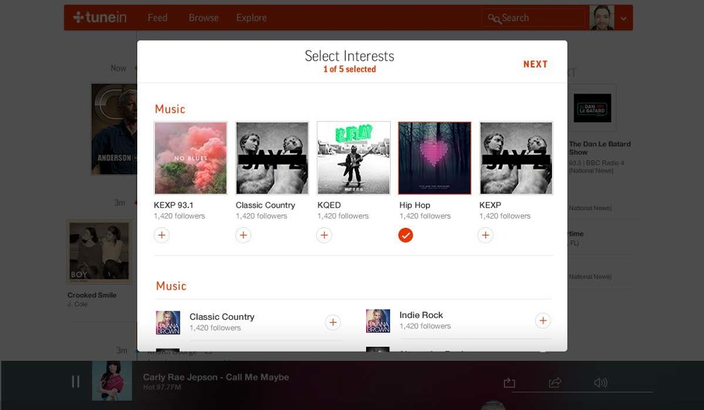 Browse
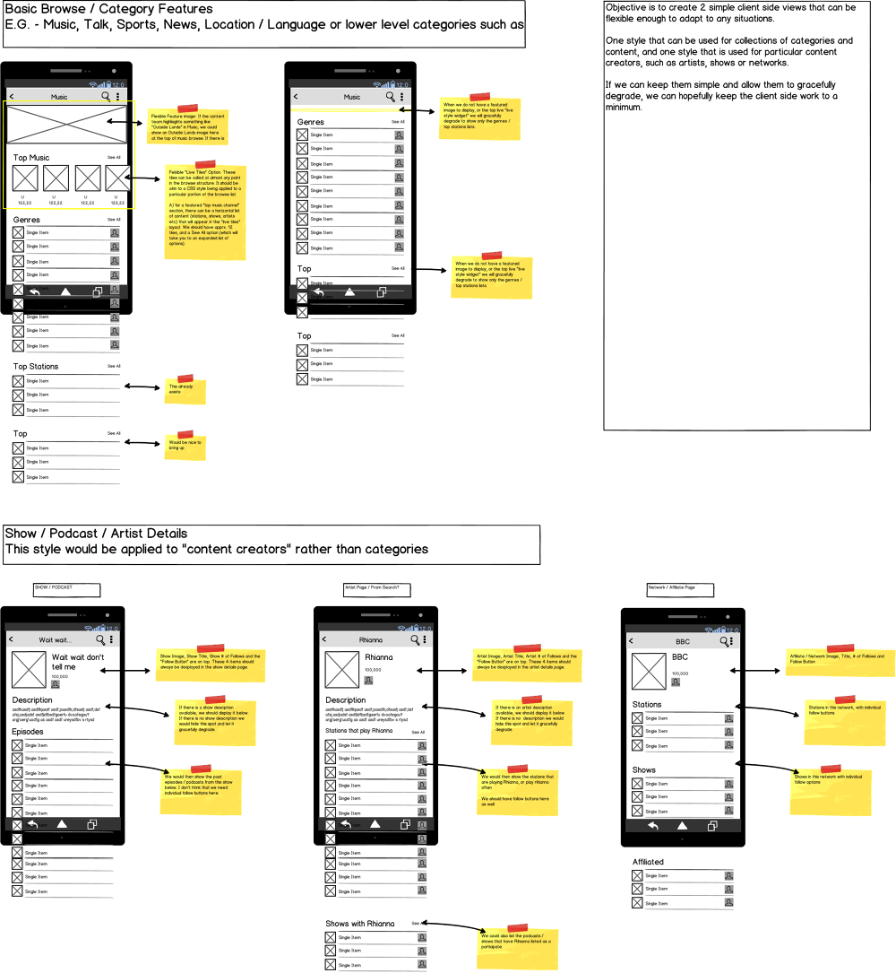
As part of this launch we also redesigned our main Browse experience. We introduced the notion of "galleries" which were a horizontally organized list of boxes that a user could swipe through.
I started with wireframes and then worked with the design team to create glossy mocks for the engineering team.
Mobile Wireframes
 Mobile Glossy Mocks
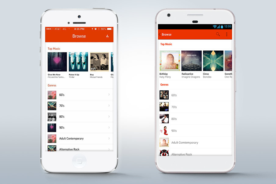 Web Glossy Mocks
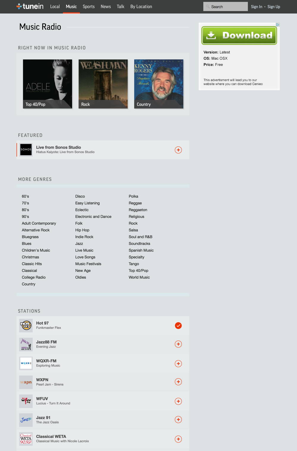 Explore
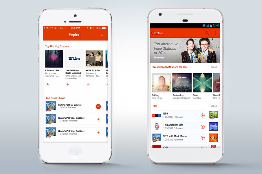
We also introduced the notion of the Explore page. We created this and ran it on 20% of users to understand how it would help them improve discovery of new content.
Mobile Glossy Mocks:
 Mobile Wireframes:
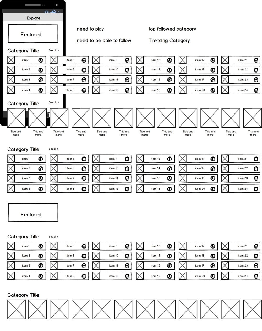 Web Wireframes:
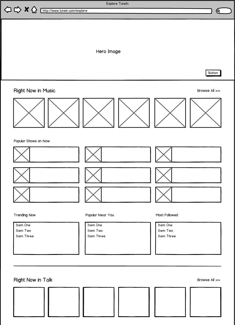 Web Glossy Mock:
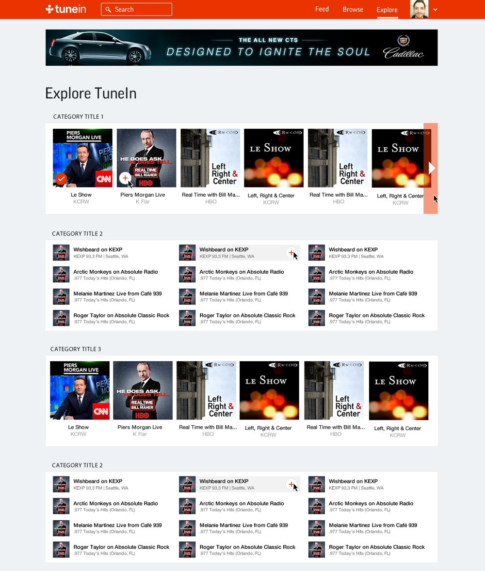 Credits:
Boone Spooner - Product, UX Design
Garrett Olinger - Android UI / UX Design, Visual Design
Max Batt - iOS, Web UI / UX Design, Visual Design