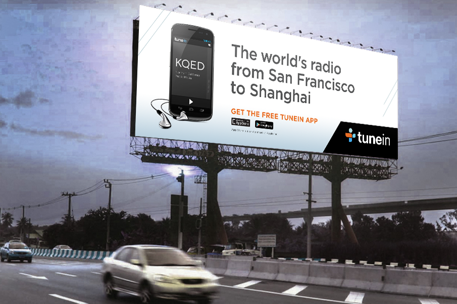
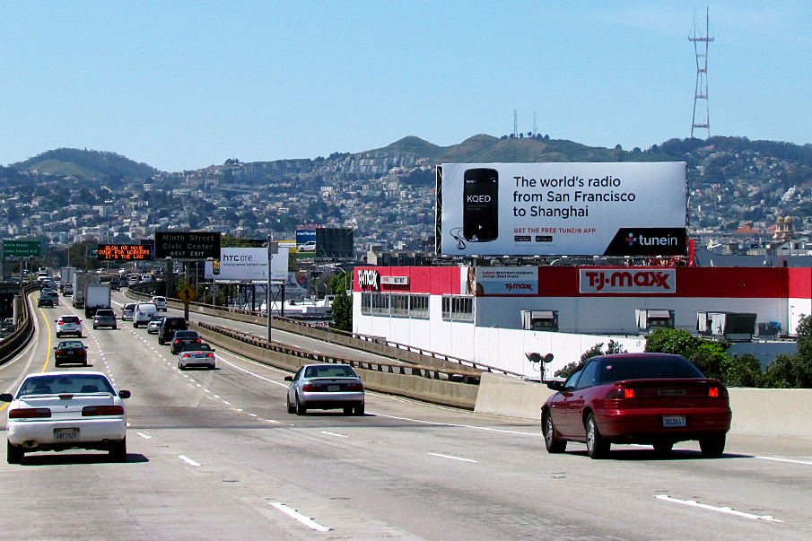
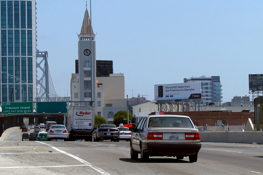
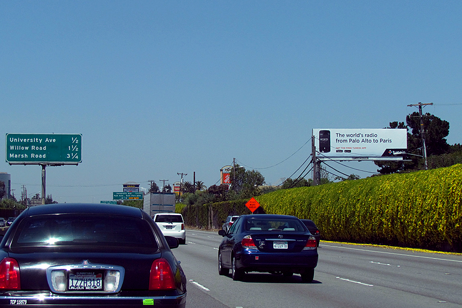
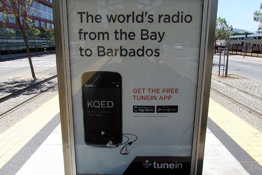
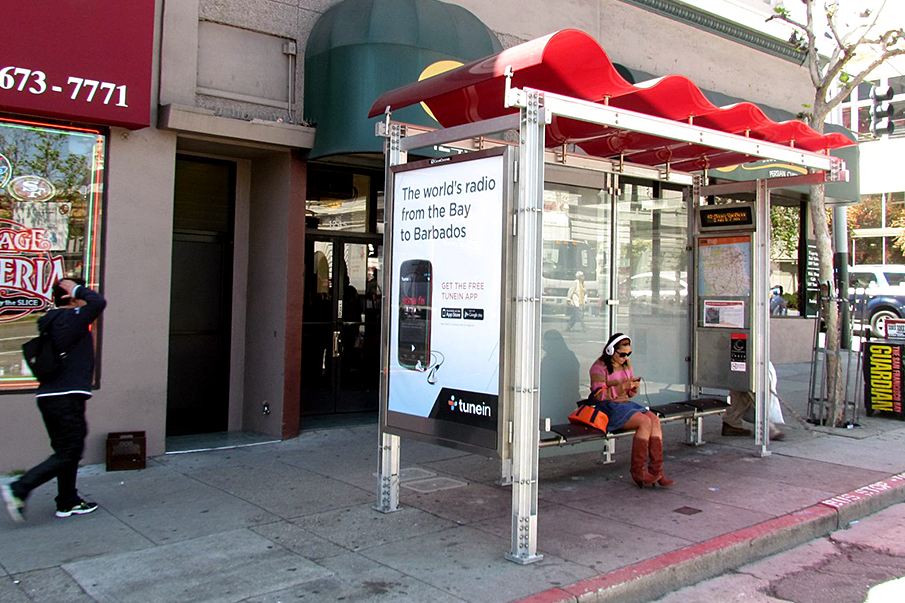
The designs had to be simple, on a white background and easy to read when doing 65+ mph. We had to integrate radio station partners, a phone, the call to action, our logo and the message. All of this had to be consumable in 3 seconds.
Common sense demanded strong hierarchy. Because this was primarily a branding exercise I fought hard to maintain the visibility and strength of the "world's radio" message and stark contrast black box around the logo. In the end, if the daily commuter was to take away anything it would be a strong sense of what TuneIn offered them.